So. New website layout. Pretty awful right? I'm poking through to try and figure out what all I'll be commissioning the theme creators to "fix" for me, so this is a pretty good time to ask if there's anything you guys would want (aside of the obvious more frequent updates).
• More constrained under-page text section for commenting. I'd like it's borders to line up with the comic page instead of this 100% page width stuff.
• A dedicated "blog" section for the front page, like this only you'd be able to interact with it, so these conversations don't get locked under comic pages and become impossible to hunt down.
The only thing I think I DO like for this setup is having a list of the latest pages on the landing page instead of just the latest page. I'd definitely want the latest to be big enough for the thumbnail to quickly show if you've seen that one or not, but it's always bugged me that the only way I could really pass news along was through the latest page's comments.
In the meantime, please sound off in the comments for the new page for any of that website feedback/feature request.
Latest Comments
Thank you again. I've found the problem, so hopefully this won't be an issue again.
It did the small thing again
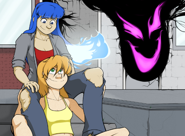
OIC, thanks. Is the Meanie’s flame different from Sare’s, since it’s black in color?
That's the purple meanie wearing Derrick Franklin's skin. Not exactly a competitor, more like an antagonist.
Wait a sec… are those flames on the guy’s hand in panel 4? Does Sare have competition?
6 thoughts on “Let’s Talk About the Meanie”
All-Purpose Guru
Ok, I gotta see that painting behind Mark’s head.
ApollineAllura
I know we’re figuring things out here but I’m super here for the headpets.
All-Purpose Guru
I’m diggin’ the logo on the back of Mags’ computer.
Ryan Gindlesperger
Oh man. That’s from an inktober back in 2016.
https://www.deviantart.com/aaronmizuno/art/Inktober-2016-1-638987722
Kinda Xiu Mei-ish.
wessodog
Gotta, gotta, gotta play Ragechaser Typhoon IV! Old school pinballer here!
It IS pinball, right?
Ryan Gindlesperger
Absolutely, definitely, yes.
Latest Comic Updates
#415. WIP – Bragging Rights
Mar 27, 2024
#414. WIP – Bad Phone Etiquette
Mar 20, 2024
#413. WIP – You Know a Bog Lady?
Mar 13, 2024
#412. WIP – On The Menu
Feb 28, 2024
#411. It’s Not About Length
Feb 21, 2024
#410. Glass Goes Up. Glass Comes Down.
Feb 14, 2024
#409. Nuking the Nuclear Materials
Feb 07, 2024
#408. Moving Pieces
Jan 31, 2024
#407. Tearin’ up the Countryside
Jan 24, 2024
#406. Ahhh, I’m Falling at a 45 Degree Angle, Breaking All The Laws of Physics!!!
Jan 17, 2024
Most Recent Chapters
Act 1 Pt. 4 - Eternal Flame
Intermission 2 - Catch My Breath
Act 1 Pt. 3 - Dancing Embers
Intermission 1 - Trickle Down Effect
Act 1 Pt. 2 - Heating Up
Prequel - Conflict of Interests
Update - 5-30-2023
So. New website layout. Pretty awful right?
I'm poking through to try and figure out what all I'll be commissioning the theme creators to "fix" for me, so this is a pretty good time to ask if there's anything you guys would want (aside of the obvious more frequent updates).
Personally, I'm already aiming for:
• Archived pages sorted by chapter.
• Less subtle navigation.
• More constrained under-page text section for commenting. I'd like it's borders to line up with the comic page instead of this 100% page width stuff.
• A dedicated "blog" section for the front page, like this only you'd be able to interact with it, so these conversations don't get locked under comic pages and become impossible to hunt down.
The only thing I think I DO like for this setup is having a list of the latest pages on the landing page instead of just the latest page. I'd definitely want the latest to be big enough for the thumbnail to quickly show if you've seen that one or not, but it's always bugged me that the only way I could really pass news along was through the latest page's comments.
In the meantime, please sound off in the comments for the new page for any of that website feedback/feature request.
Latest Comments
Thank you again. I've found the problem, so hopefully this won't be an issue again.
It did the small thing again
OIC, thanks. Is the Meanie’s flame different from Sare’s, since it’s black in color?
That's the purple meanie wearing Derrick Franklin's skin. Not exactly a competitor, more like an antagonist.
Wait a sec… are those flames on the guy’s hand in panel 4? Does Sare have competition?