Chapters
Update - 10-8-2025
Have way too much short-dated commission work to be able to get a comic post together this week. We will be at Tsubasacon this weekend in Charleston, WV.
Update - 8-6-2025 - Had some computer issues amidst upcoming convention prep, so I'm having to push the August 6th update to next week. Apologies, all.
Update - 5-13-2025
Back at the beginning of April, I'd went on a bit of hiatus to make the end of Act 1 this magnificent (admittedly basic) animatic. Pretty much keyframes with limited animation. I had some time between conventions and really thought I'd get to dig into this.
Now, after a lengthy commission queue (because income), a near-week-long power outage (Right after a big grocery trip. Lost everything), and setting up a VGen account (https://vgen.co/Aaronmizuno because income), I have nothing for that animatic and a show looms.
I knew it was a long shot, but we're all doing what we can. I'll be resuming normal updates for now, with hopes of eventually rounding back to that animatic plan.
Update - 2-04-2025
Big thanks to everyone still sticking around.
There's been a lot of weird website outages thanks in part to a DDOS attack on some of the Dreamhost-related servers that houses this humble webcomic. My inbox is spammed with dozens of mini-outages. Fun.
Fun in a not-sarcastic tone is the slew of conventions we're currently lined up for. We just came back from Setsucon in Altoona, PA, and have already been confirmed for nine more by July. Big relief, that.
In-story, we're (finally) approaching the end of Act 1. It only took thirteen years.

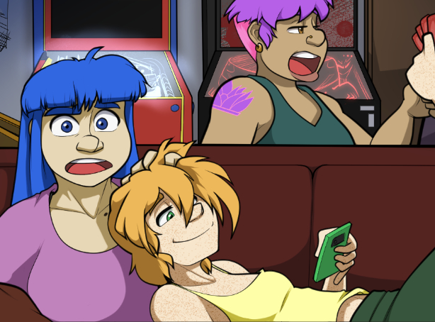
 Intermission 3 - Landslide
Have a great time!
I take comfort in how she's not even on his radar.
OMG. Not much more to say. Ominous that Min Hua's not represented.
Meet those peeps! Sell that merch! Have a great time, and safe travels!
She's really just gotten around. That's part of a different can of worms.