So. New website layout. Pretty awful right?
I'm poking through to try and figure out what all I'll be commissioning the theme creators to "fix" for me, so this is a pretty good time to ask if there's anything you guys would want (aside of the obvious more frequent updates).
Personally, I'm already aiming for:
• Archived pages sorted by chapter.
• Less subtle navigation.
• More constrained under-page text section for commenting. I'd like it's borders to line up with the comic page instead of this 100% page width stuff.
• A dedicated "blog" section for the front page, like this only you'd be able to interact with it, so these conversations don't get locked under comic pages and become impossible to hunt down.
The only thing I think I DO like for this setup is having a list of the latest pages on the landing page instead of just the latest page. I'd definitely want the latest to be big enough for the thumbnail to quickly show if you've seen that one or not, but it's always bugged me that the only way I could really pass news along was through the latest page's comments.
In the meantime, please sound off in the comments for the new page for any of that website feedback/feature request.
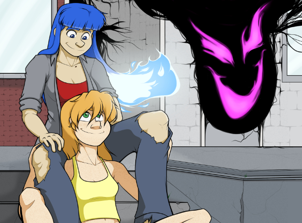
Utterly inconsequential? Min Hua is gonna have something to say about *that*.
That is correct~!
The new link on the top menu will pop the correct RSS address. For whatever reason, instead of just going…
Luckily, this is one of the few comics I like so much that I check it regardless of it popping…
Uhhh, wait, now, that "first ping" that hit Rei back in the hospital *wasn't* the purple meanie? There's a secondary…