

Chapter: Act 1 - Ignition
A greater force expresses its will upon the world, tipping the balances humanity had become comfortable with and starting a chain reaction that will set the world ablaze.
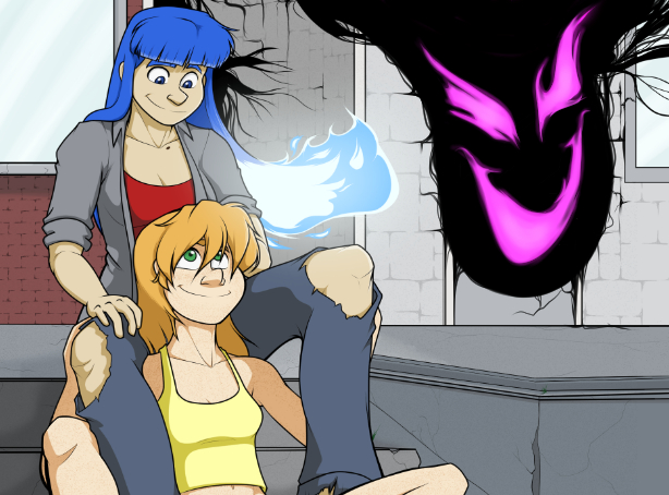
… Or… we could go focus on the lives of teenage girlfriends Sarah Gains and Ashley Sims. That sounds good. Let’s go with that instead.
-

Not Enough Information
Sep 27, 2017
-

Snuggle Buddies
Sep 20, 2017
-

Master of Deception
Sep 13, 2017
-

Sticking Point
Sep 06, 2017
-

One Woman Landfill Alternative
Aug 30, 2017
-

Getting Back to Routine
Aug 23, 2017
-

Throw Your Weight Around
Aug 16, 2017
-

A Fresh Start
Aug 09, 2017
-

Skip Day?
Aug 02, 2017
-

Good Morning
Jul 26, 2017
Why do Rei and Min Hua have elven ears? I’m glad you’re back, but I’m having a hard time with…
No worries. Gotta make bucks and pay bills.
Oops. Tactical error. Personally I think they need to deal with the evil rogue elf.
And the bloody cough-cough is a nice touch. Being resurrected from God-knows-where is messy and has unknown long-term side effects.
Heh, I've noticed that in Mastery, bad actions/consequences trump good intentions every time.